To get a product ready for scale-up, I helped a team stuck in delivery mode break some assumptions and get to a solution that would stand the test of time.
Customer
Springer Nature, Jan-Mar 2019
Team
Me, Lead designer, Delivery manager,
Front/Back end leads
Role
Feature design lead
Responsibilities
Product vision; UI design; UX design; User research; Stakeholder communication
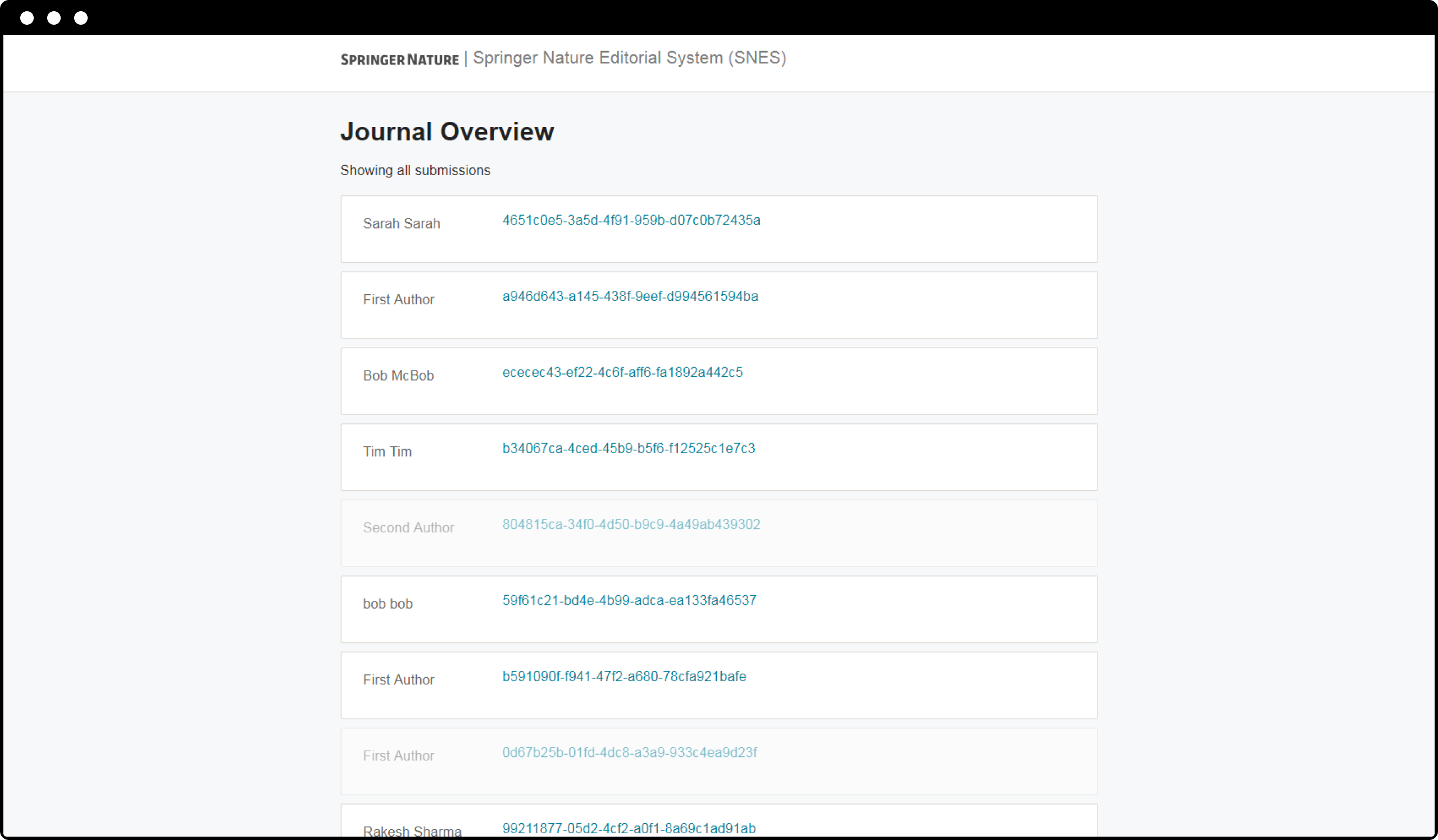
Springer Nature were building an in-house application for their editors to use to manage the peer review process for their 3000+ journals.
They’d built an MVP. Now the team was tasked with scaling up from ~5 new submissions a week, to >7 a day. With the pressure the team was under they had gone into head down delivery mode, where the first idea was stuck to without much questioning.
I joined the team to help them figure one of the main issues scale would bring, i.e:
As the number of submissions increased, how would users find anything?
A hacky filtering system had been built by the engineers, but it was unfinished. I was tasked with:
I was new to the company and product, and I took it for granted that this was the right approach.
I worked with the engineers to create a list of available data.
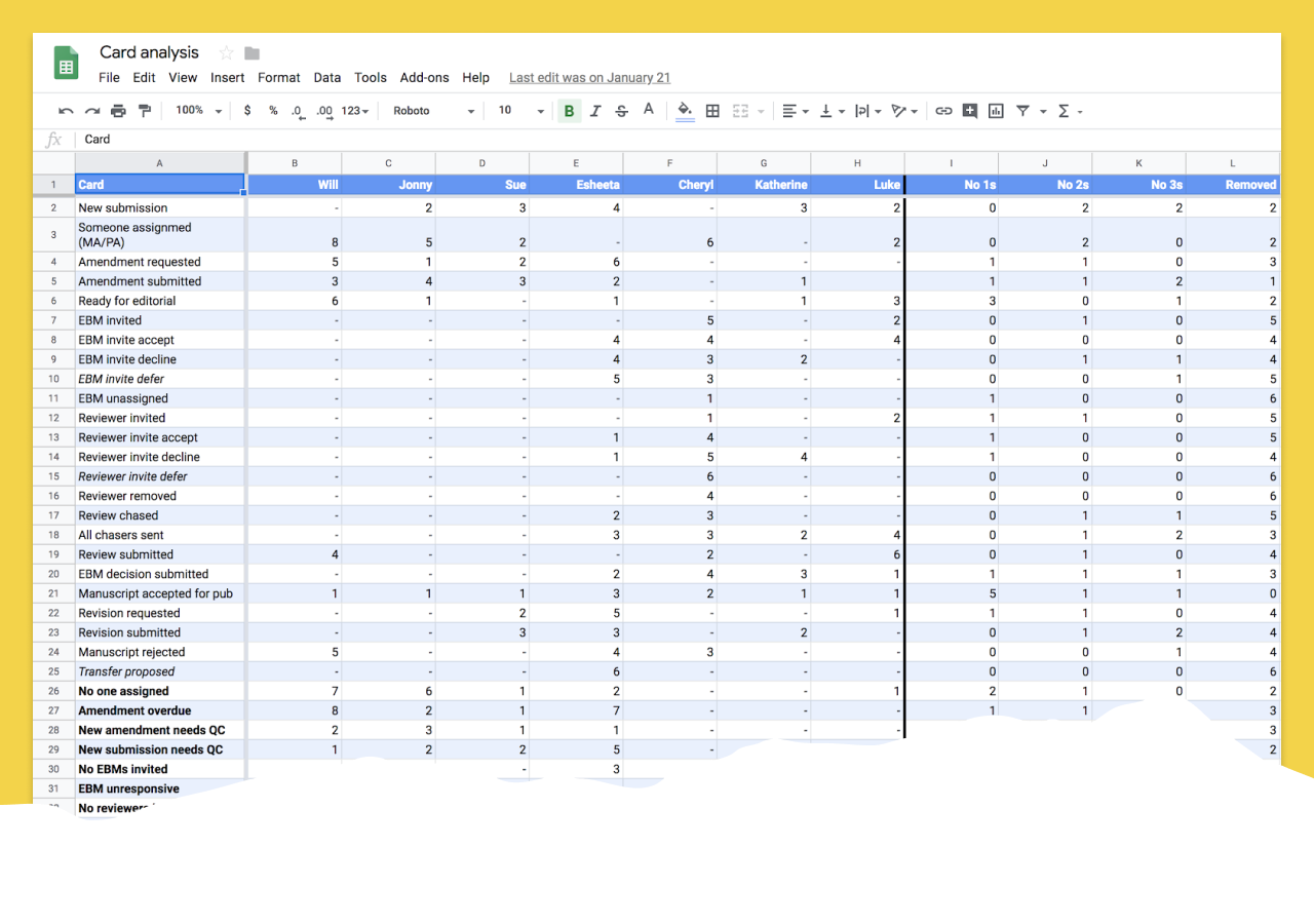
I recruited a panel of users to attend a recurring feedback session. Then I facilitated a card sorting workshop to understand the data points they would want to filter by, and how they would group and prioritise them. This would inform the UI.
After the workshop I did a quick analysis and comparison of the results and had a good first pass of what the filters should be.
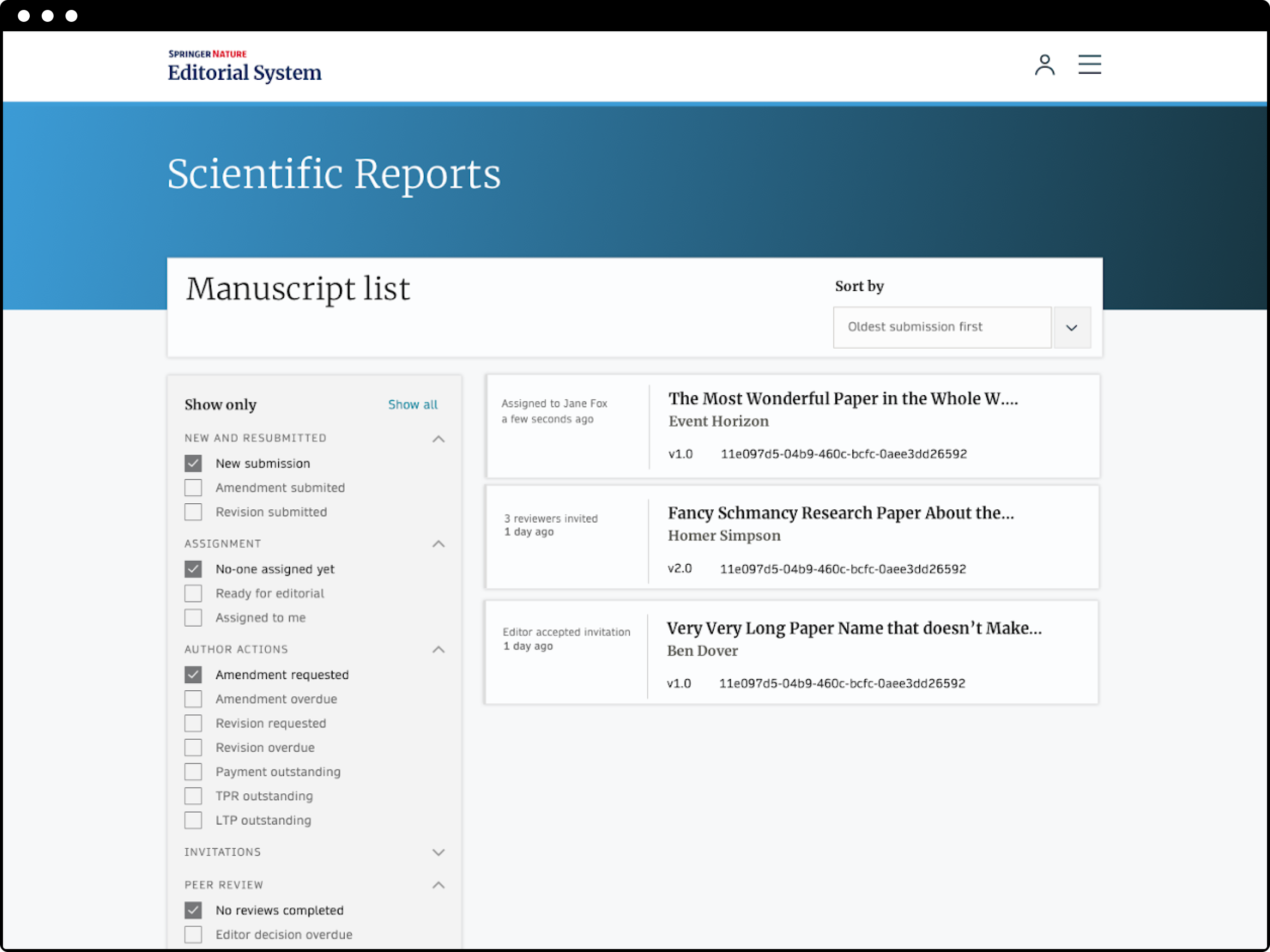
I took the list and put it into a prototype and went around to the desks of the user panel to test it.
It was a disaster.
What we had didn’t solve the problems they needed to overcome, at all.
Back at the drawing board, I decided to interview the users from scratch, forgetting everything the team had already built.
I asked each user to draw their mental map of how submissions were grouped and categorised.
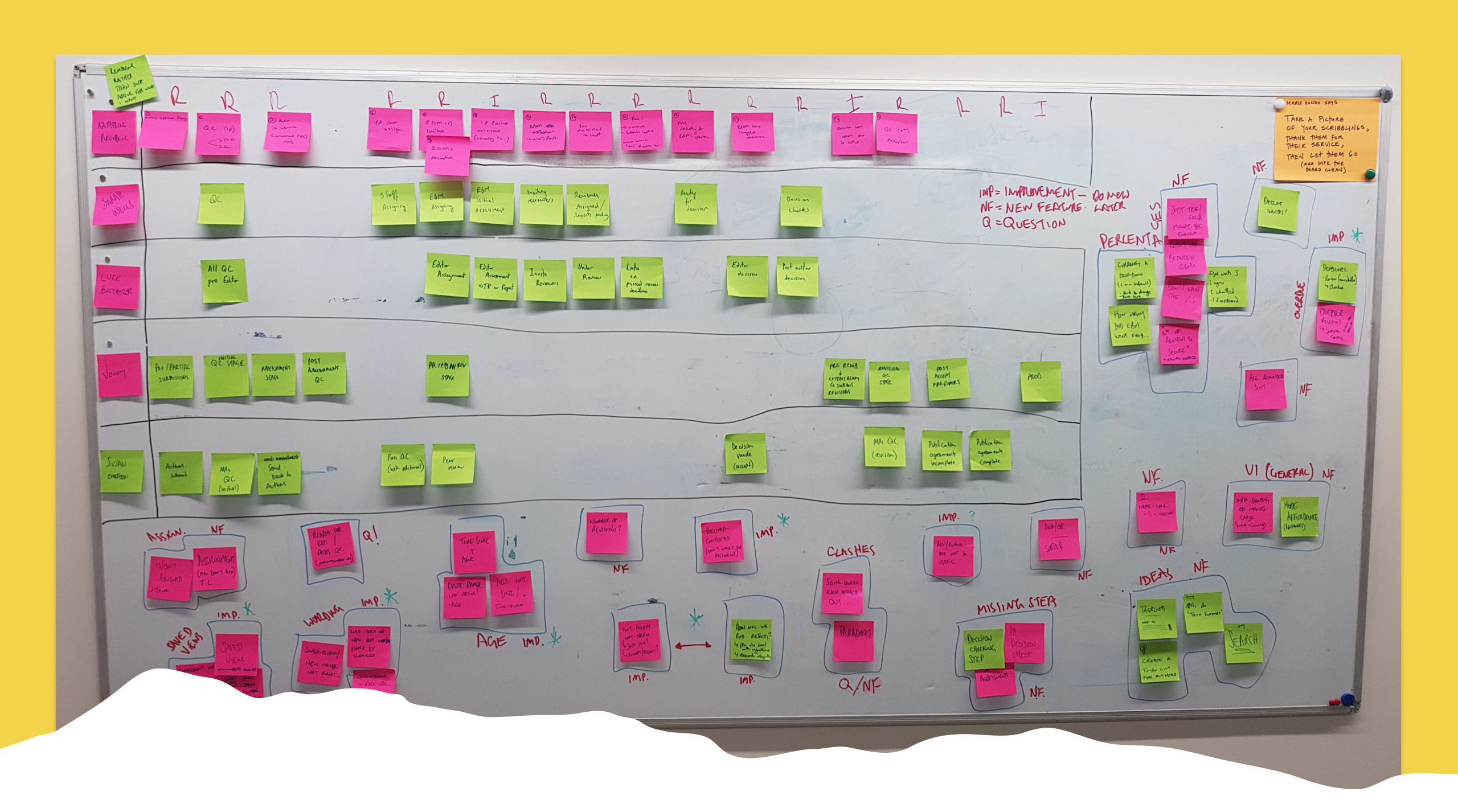
I realised I hadn’t interrogated the problem properly. Users didn’t want to filter things, they weren’t coming to the app to use filters...
Filters help people find things, but why do they need to find them to begin with?
Users need to be able to find submissions to work on, quickly, as different kinds of submissions require different tasks. And, tasks are handled by different users, so, the categories that make sense for one, might not for another.
Our users (editors) wanted to do their jobs! Everyone of them worked differently, was responsible or specialist in different areas and in different ways at different times.
We needed to build a system that was flexible enough to work for everyone but direct enough to be able to help an individual user when they wanted “to see submissions like THIS…” or “submissions NOT like THESE…”
I took inspiration from a few tools I had used in the past that achieved something similar. Getting the interactions right - usable for users, buildable for developers - was crucial. So after a few sketches I jumped into writing HTML/CSS/JS to make a working prototype.
The feedback from both camps was great. After a few rounds of fine tuning we had an approach that:
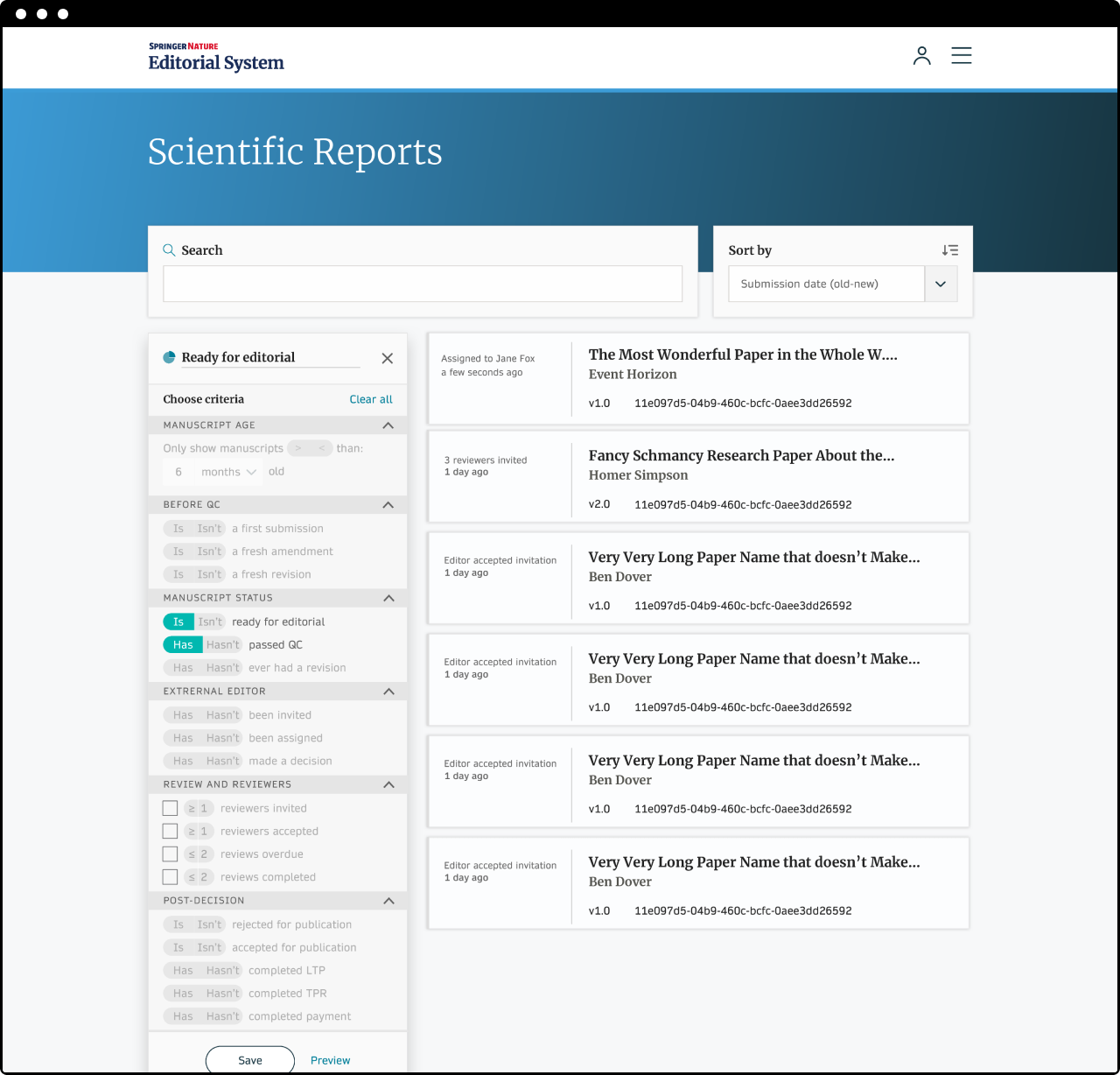 Try the prototype 👉
Note — It looks a bit off because I have lost access to some files, but it still works!
Or, view all screens 👉
The deadlines and delivery pressure the team was under hadn’t gone away. We needed to be sensible with how we built this, to make sure that we got enough of it live to prove it worked IRL, without losing engineering time from other critical tasks.
I lead a user story mapping session with the team - something they’d never done before - to properly slice and prioritise the requirements for our proposal.
I started with a game about getting to work in the morning, and all the tasks required. Every round the time available decreased, introducing them to a prioritisation mindset.
With a first release defined we set to work building it, in time for the scale-up deadline.
The biggest risk - lost submissions, or submissions that needed attention and never got it - never happened. Relief.
We saw different user types using the views in ways we’d never expected, to build reports, to focus on diversity. There was so much more we could help with.
As a result of the scale up, a lot of the users were completely new. Being able to configure some things (with opinionated defaults) helped ease them in.
We were manually introducing the tool to all the users through in-person training. To scale more, we would need to solve onboarding.