To fix a mess of registration forms, with a mess of usability issues, across a mess of products, I helped Babylon build a system that enabled change, learning, and growth.
Customer
Babylon Health, Jun-Oct 2020
Team
Me, Head of Product
+ support from tech leads, a content designer, and a user researcher
Role
Lead designer
Responsibilities
Product vision; UI design; UX design; User research; Stakeholder communication
The Head of Product in the USA successfully pitched for budget to sort it out. He set me the challenge, with total ownership, to “fix registration.”
I interviewed product managers, marketers, analysts, designers, engineers, and the legal departments in every market to build an understanding of what “fix” meant. Putting it all together I came up with some principles:
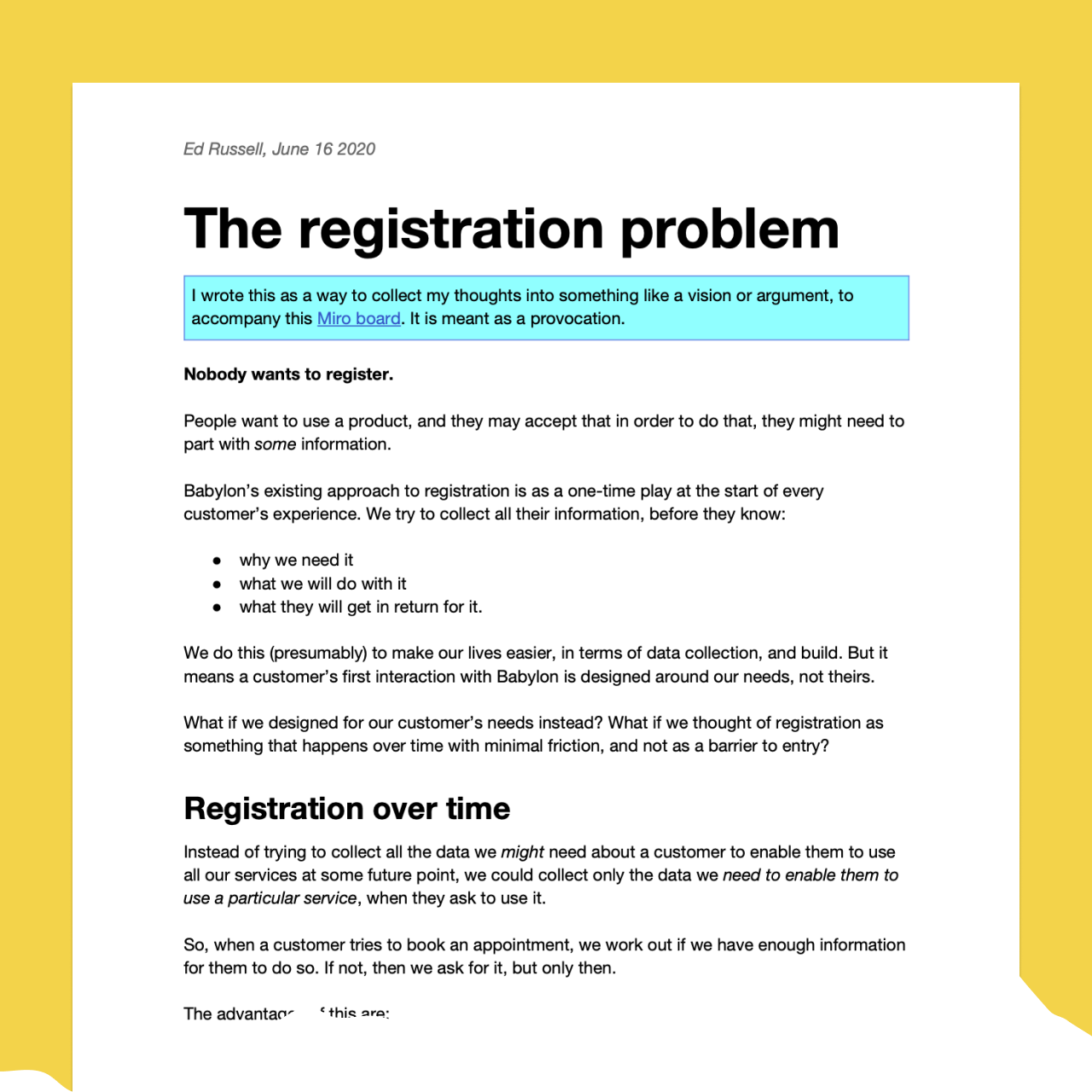
I wrote a provocation and sent it around all the product heads, and senior leadership. Trying to unite them behind my vision.
Nobody wants to register. People want to use a product, and they may accept that in order to do that, they might need to part with some information.
Realising how this could mean less work for everyone, and result in better quality “leads” coming into product areas, we got our allies.
I took inspiration from interactions patterns that already existed in other parts of the app; from our nascent design system; and from a collection of other “good” registration experiences surveyed from the design and development teams.
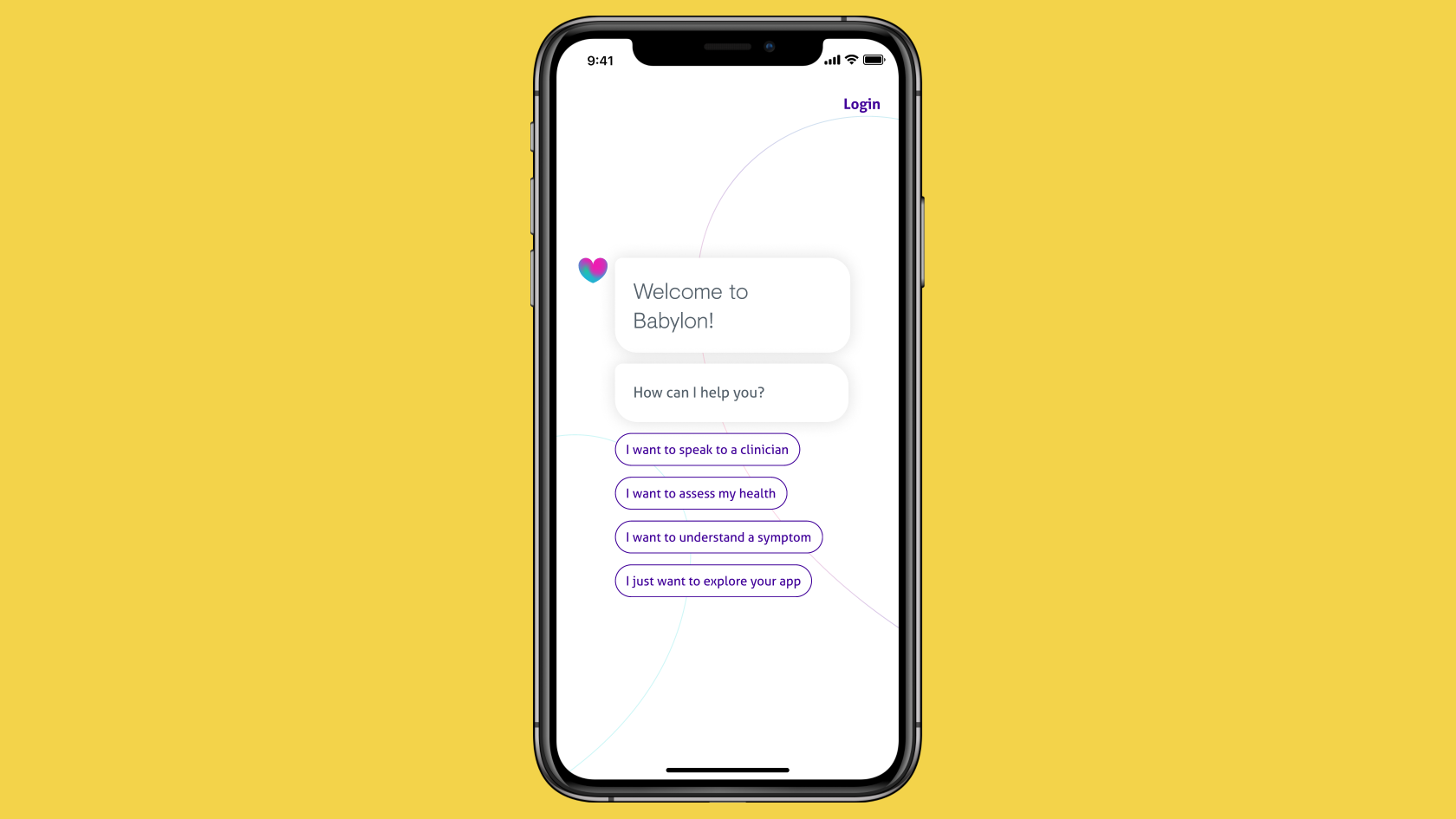
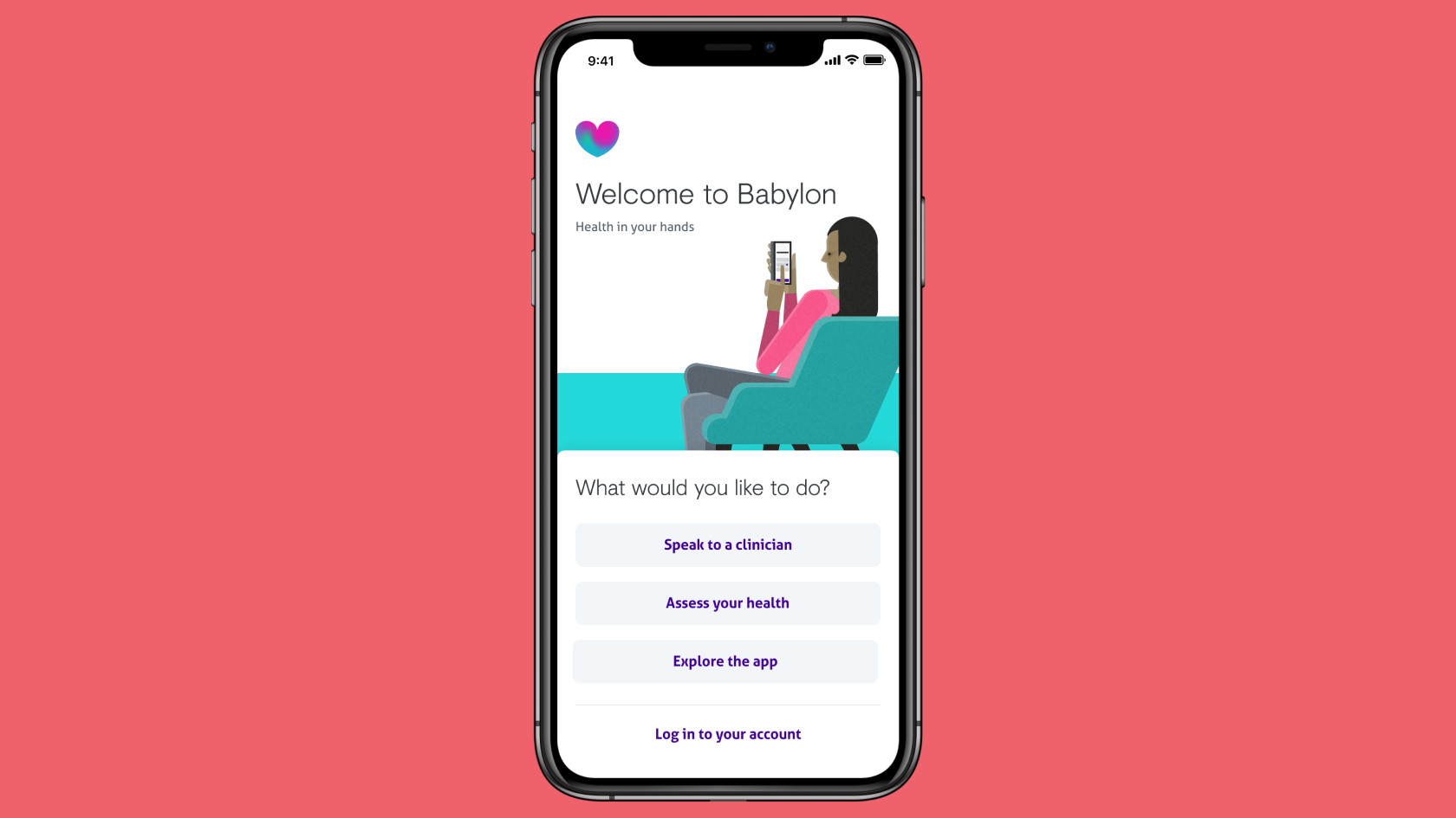
Each approach followed a few design principles
After a few rounds of sketching, I had these prototypes ready to show.
With the prototypes built I set about gathering feedback: from the engineering team; the design system team; and senior leadership. We also ran a set of remote usability tests with a range of customer types.
“It was as entertaining as a login process could be!”
These all confirmed our approach was as valid (with a few tweaks) as any prelaunch testing could.
Only getting it built and used in the wild would prove we'd made the right decisions though. And a new product launch in the states provided the perfect opportunity for us to do this, as it required adding even more complexity to the registration process.
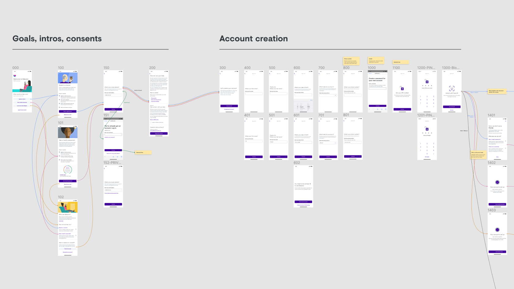
With the development team we set about turning our vision into something realisable, given the time constraints the launch placed on us. We focused on a few key parts of the journey and simplified the UI.
This would allow the engineers to build it the right way, in the time they had, whilst still releasing enough to prove our idea fully.
I worked embedded in the development team to get it built just in time for the new launch. Then we waited, watched, and learned.
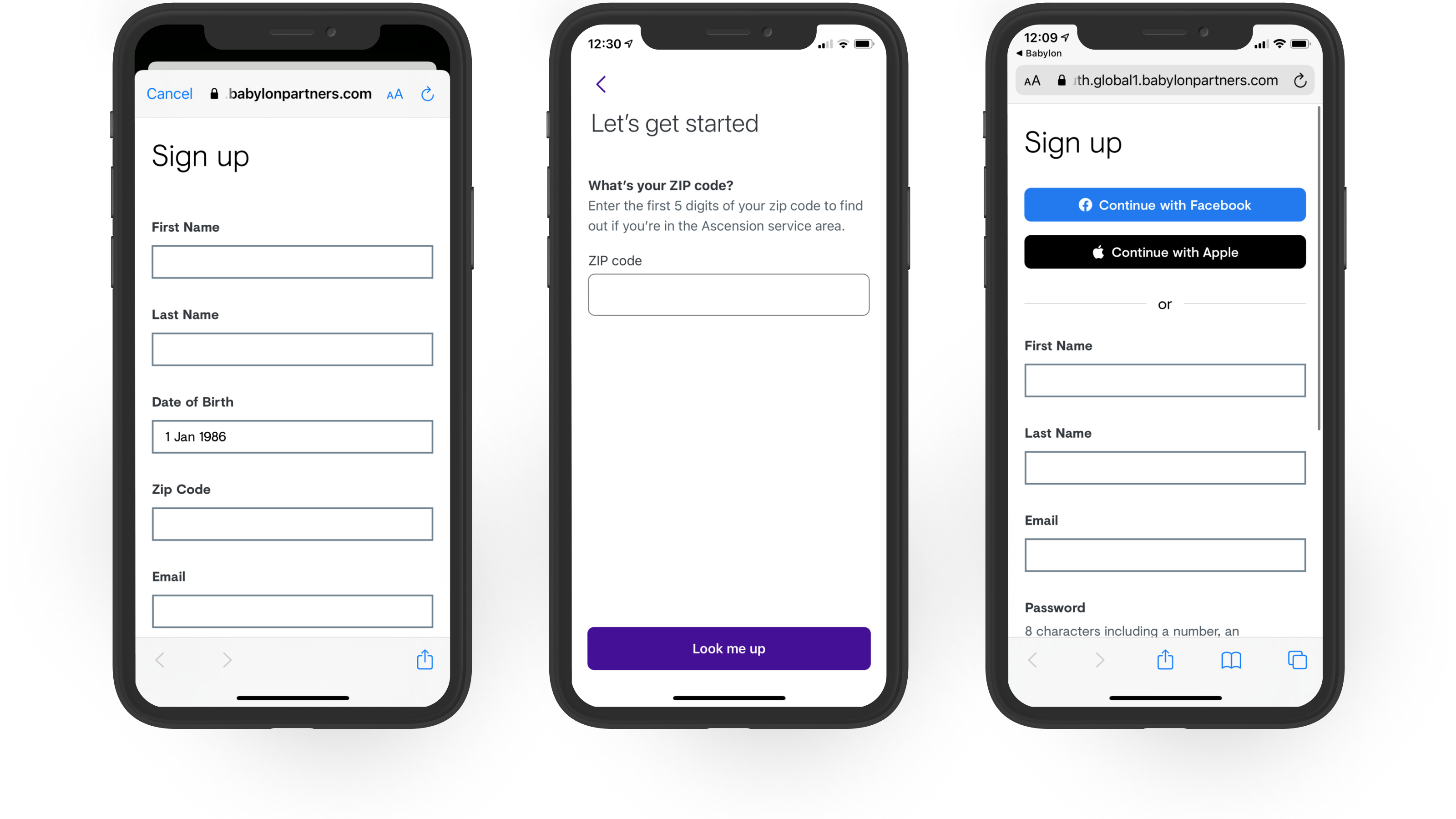
We did NOT see an increase in drop-offs as a result of adding screens in. We attributed this to proper progress indicators and the extra context provided for WHY we asked each question.
Customers who made it through the process were more likely to activate and complete a core action. Whether this translated into retention remained to be seen.
We didn't make it worse, but we didn't make it much better. We hypothesised this was because the customers still weren't comfortable handing over some data. We needed to strip it back more.
While devs/desginers understood the system, product managers and marketers struggled. Which risked them circumventing our system and we'd end up back where we started.